Hello!
Ardour is a GREAT audio\music production tool, but it really needs a nice new look.
I would like to try to create a new modern UI theme for Ardour.
Where should I start? How the default themes are made?
Hello!
Ardour is a GREAT audio\music production tool, but it really needs a nice new look.
I would like to try to create a new modern UI theme for Ardour.
Where should I start? How the default themes are made?
You don’t stand a chance. Ardour isn’t skinnable. You can change the colors. You can’t change the visual appearance in any fundamental way.
Also, please understand that visual design is inherently subjective and you will invite less antagonism and more support if you avoid language that attempts to sound objective, such as “it really needs a nice new look”.
@pofigoon: you might also make sure that you are seeing the very latest version (the nightly releases) and have “reset” your theme. There have been LOTS of changes to the UI since 3.5ish.
@paul: Please don’t get me wrong. I’m not saying it is looking bad.
What I really mean is that Ardour had significant functionality improvements last years and I feel it would be great to have some changes in UI not only to give it a new slightly fresher look, but to optimize the workspace as well:
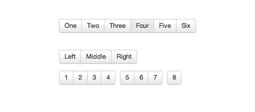
gaps between buttons of a same group (like REC-MUTE-SOLO, transport controls etc) and selectboxes could be removed entirely (use buttongroups instead of standalone buttons).
rounded corners on UI elements could be an optional setting.
when corners on UI elements are not rounded there’s no need to have inner padding in toolbars (the buttons could fill the whole height of a toolbar) = extra vertical room for something else.
we could update icons as well
…
I’am the web application designer\developer myself and I would really like to contribute to such a great application as Ardour.
@pofigoon: sure, I understand where you are coming from, but you apparently think that ardour is built around some technology that makes it simple to “skin” things or change the way that basic UI elements are drawn. If you think that it is like web development, you are completely mistaken.
GTK2 does not use a CSS-like themeing system. It uses theme engines which are written in C and compiled. We currently use the Clearlooks engine. Writing a new theme engine is a huge task, and even modifying a theme engine is not for the faint of heart. GTK2 does not have button groups like the ones you’ve shown. It is already possible to NOT use Clearlooks but we are not interested in supporting this as a user option because it makes our life much too complicated and for too little gain.
Complicating matters further is that more and more of the Ardour GUI, particularly in the editor window, but also in the mixer strips, is moving away from using GTK for anything related to drawing. This means that whatever you might learn or know about themeing in GTK2 is less and less relevant going forward.
@paul: It would still be good to have someone with proper graphical design skills on board though? Irrespective of the underlying toolkits / technologies etc, this is the kind of thing which requires a specific expertise / talent, much like aspects of audio design, and it can be difficult to find that mix of skill sets for a project like ardour (or even a more commercial project), so surely there’s still a role, for someone who is offering those skills, even just for things such as colour schemes, splash screens, icons etc (all of which I think could benefit from a refresh? ). Sure its subjective, but think of all the great features which ardour has to offer, and yet it doesn’t ‘draw you into’ using it, at least, not in the way that e.g. Logic etc do. Its improved over the years, but its still very utilitarian in its design.
web application design is completely different from graphical design, and the good web application designers i know tend to defer to actual graphical artists for that stuff.
the problem is that people need a way to apply their skills, and people who are used to web-style application design, or skinnable interfaces, will just find no way to do what they want to do. they won’t even find any analogies for what they are expecting.
and yes, it is absolutely subjective. and also absolutely impacted by the number of people working on it. ardour’s technical implementation is shaped by the fact that we are (relatively) coder-rich and visual-designer poor. we therefore structure things to that coders can get stuff done easily, rather than so that visual designers can drop their ideas into place easily. contrast that with waves, for example, who put a strong premium on a design that allows their visual designers to just drop stuff into place, even though i think it results in a weaker interface for users who want options (for example, you cannot change font sizes with that kind of system) and also makes it hard to do the things that MUST be done in code.
web application design is completely different from graphical design, and the good web application designers i know tend to defer to actual graphical artists for that stuff.
perhaps I read something into the original post then, but I assumed the OP had some kind of graphical design skills in addition to (web) application design (and that might also be true I guess / hope )
contrast that with waves, for example, who put a strong premium on a design that allows their visual designers to just drop stuff into place...I'm sure they do, and most likely because (rightly or wrongly) as commercial applications, theirs have to look the part. Whether it should be so or not, the fact is that if you want to get people interested in a product / application, it has to stand out, especially if you want them to hand over money for it, and the best way to communicate that concisely, is visually. The difference to me, is that when I start up e.g. Logic, its kind of like I want to do stuff with it, even if I don't need to - in that respect its just enjoyable to use and even though like all complex software, there maybe a few things that aren't working perfectly, I can forgive it that, because it looks like a lot of effort and professional work has gone into it. Ardour is almost the opposite - a lot of professional coding and audio expertise goes into it, a lot and the code quality is outstanding compared to many open-source projects, but visually, it doesn't look like that, by comparison it looks kind of nailed together, which doesn't inspire confidence when things do go wrong. All I'm trying to say is that if someone comes along and says they want to contribute to making it look like the quality application it is (or could be, when a few show stopper issues are fixed...) then they should be welcomed in, rather than potentially discouraged - let them have a go, see what happens, after all, I know for a fact that many of ardour's professional audio / functional / operational features have come from contributer(s) with many years of signifcant pro-audio industry expertise, but not necessarily complex coding experience.
I understand pauls point that the main priority is not to support graphical artistry. (i even believe that it wouldn’t add to ardour’s image if were too easy to skin stuff, while swamps of half baked green and yellow themes would start to form everywhere …)
However I think that there is a difference between fancying things up desingwise, and improving graphics to get things done easier. Pofigoon actually made some valid points of improving the gui for the sake of practicality. another example for instance are the dashes on the meters indicating position and negative value. some daws drop the negative dashes to retain space and less confusion. These choices are indeed subjective and I am often unsure if they actally qualify as valid feature requests, but giving these things a thought, is far from “i would like to have a steampunk look”.
For a potential newcomer, offering his spare time on gui improvement, why not give him or her a clue where to look for in the cairo code.
The other reason I kind of homed in on this (again) was because I’ve been doing some development / testing on Mac recently, and, that is where the difference is stark. You still can get away with a fairly utilitarian look and feel on linux (though less so recently) because linux applications aren’t renowned for being easy on the eye… but now Ardour is becoming viable on Mac again, the contrast when compared to the recent improvements in OS X look and feel is very apparent. To some extent, I suppose that’s a GTK thing (has anyone ever thought of, maybe an ‘Ardour 5.0’ which pairs libardour with a JUCE based UI…??  )
)
we are not ever going to switch toolkits. we are going to move further and further away from relying on widgets from the toolkit that we have now. the biggest change i can see is possibly (just possibly) switching to gtk3, which would allow access to their CSS-based themeing system, but we are still not really interested in that because we want to avoid using almost all widgets except the big 3 or 4: file browser, tree/listview, etc.
note that Logic does NOT use the normal Apple GUI toolkit (neither does Garageband). and neither does Pro Tools or Ableton Live or Nuendo or …
@linuxdsp: you’re also very,very wrong about Waves. They use the design methodology that they do because they can. They’ve had years of creating almost entirely static user interfaces. They have almost no experience at all with dynamic user interfaces, because their plugins don’t do that. Just like almost all plugin makers, in fact. Waves has chosen to go with a very skeuomorphic GUI design philosophy, which is completely inappropriate for a DAW. Tracks Live (based on Ardour) looks very different from their other applications, partly because they started from Ardour and partly because it is a (sort of) DAW.
It is true that I do tend to respond a bit too negatively to people who want to “improve the GUI”. And that’s a mistake. But it is a response shaped by years of encountering people who say this but don’t have any actual understanding of the problems involved, the GUI technology we’re using, and the issues we already want to work on.
Pointing people who do “design” in the direction of some C/C++ that uses Cairo for drawing might be considered even more aggressive by some people.
Well… Still I would like to try.
I know how gtk2 RC files are working and I am sure that I can provide at least a customized GTK theme for Ardour.
Also I would like to try to use Murrine engine instead of Clearlooks.
Please feel free to point me to “the direction of some C/C++ with Cairo”. I would really love to see how it’s made.
pofigoon: join us on IRC (#ardour) and i (nick: “las”) will give you some pointers
I’m a designer and developer and this is also where I find that Ardour is lacking. I was thinking on atom-shell or node-webkit to use html / css / javascript as the GUI connected directly to the C++ backend but someone already told me that is a discussion made on and on and that it would be changing 3/4 of the code and so unmanageable.
Sendoushi … I don’t wish to be rude, but frankly for an application of Ardour’s complexity, web development tools are just utterly inadequate.
There is some interesting work that could be done to make a MUCH simpler tool than Ardour use an HTML+CSS+JS rendering in a desktop context. But using those tools to manage an application like Ardour? Sorry, but as rich as web applications are becoming, the tools just aren’t capable of handling it (yet). That might change over time, but they aren’t ready yet. As web applications get more complex themselves, they are running into their own headaches with the tools, many of which were solved in desktop contexts a decade or two ago.
Not to mention that some of us don’t want to clutter up our audio systems with a graphical web browser (which I presume would be required to control Ardour via HTML and javascript).
@jrigg: if I ever spend time exploring this possibility, it won’t be for use inside a web browser. It will be using the html rendering engine as a desktop app. But I have no plans to do so - it is just a hypothetically interesting idea.
Not to mention that HTML/CSS based interfaces have a tendency to become incredibly slow as soon as they get even slightly complex. I’d rather have ugly and speed than a dog interface that’s painful to work with.
Maybe instead of starting with a full make over, it would be useful for a UI designer to do a UX analysis of the current Ardour UI, identifying specific issues, as well as potential solutions to those issues, where possible. A good example of this kind of exercise is Jamie Bullock’s analysis of Pure Data: http://jamiebullock.com/post/41281128485/the-pure-data-gui-a-ux-study - he runs through a basic workflow, identifying individual problems as he goes (sure, pure data is in much more dire need of an overhaul than Ardour - in particular a widget set that’s useable on high-def screens).
Fundamentally, it’s about usability, and while UI style does affect that (e.g. I find the white gridlines and black outlines too strong), it’s really more about layout. The current layout is amazingly good at fitting a lot of information into the available realestate.
Maybe it would be worth having a (wiki/editable?) page somewhere that keeps track of all of the minor issues that are identified on the forums and the bug tracker, so that people can see what’s in the pipeline already?